F.G. PHOTO STUDIO SERVICE (A/B TEST)
How can we simplify
the service ordering process
and clarify the terminologies for users?
PROJECT
Background
Online ordering for photo studio services was new to the market, so users lacked a shared understanding of terminology, packages, and delivery methods. During a six-month beta, we built a basic analytics system to track button clicks and page drop-offs, then validated insights through customer interviews. This project focused on improving clarity and learnability so first-time users could complete orders without heavy operational support.
Problem
Users were dropping off early and raising frequent questions because the ordering flow and service terminology were unclear, creating friction that reduced conversion and increased operational workload.
Solution
We iteratively improved the flow through A/B testing by restructuring information hierarchy, adding guided UI elements (progress bar, dashboard), prioritizing model selection earlier to surface value faster, and clarifying deliverables with tooltips and visual aids.
These changes reduced confusion while improving conversion and order success, lowering support burden and increasing operational efficiency.
TACTICS
Goal
Frame Question
"How can we improve the clarity of our terminology and descriptions to increase the order conversion rate?"
Outcomes
Reduced bounce rates through clearer information presentation
Reduced operations workload by decreasing repetitive explanations
Expanded the user base by improving the first-time ordering experience
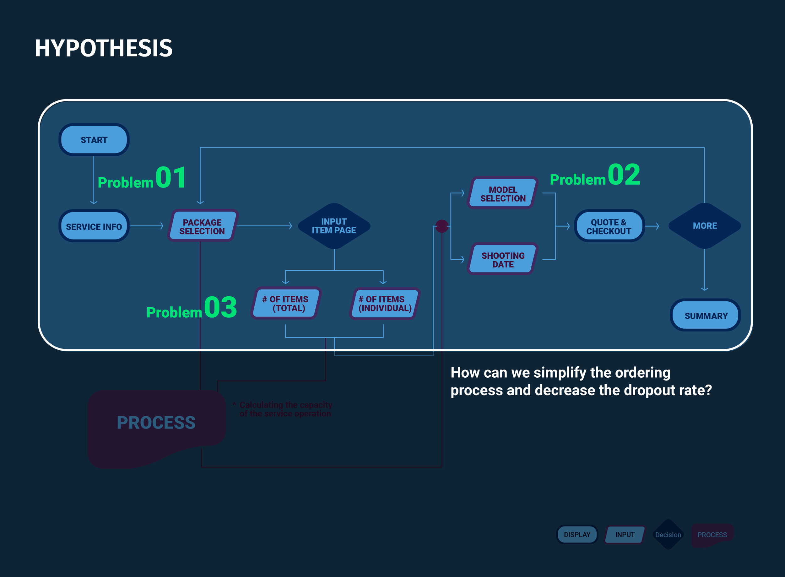
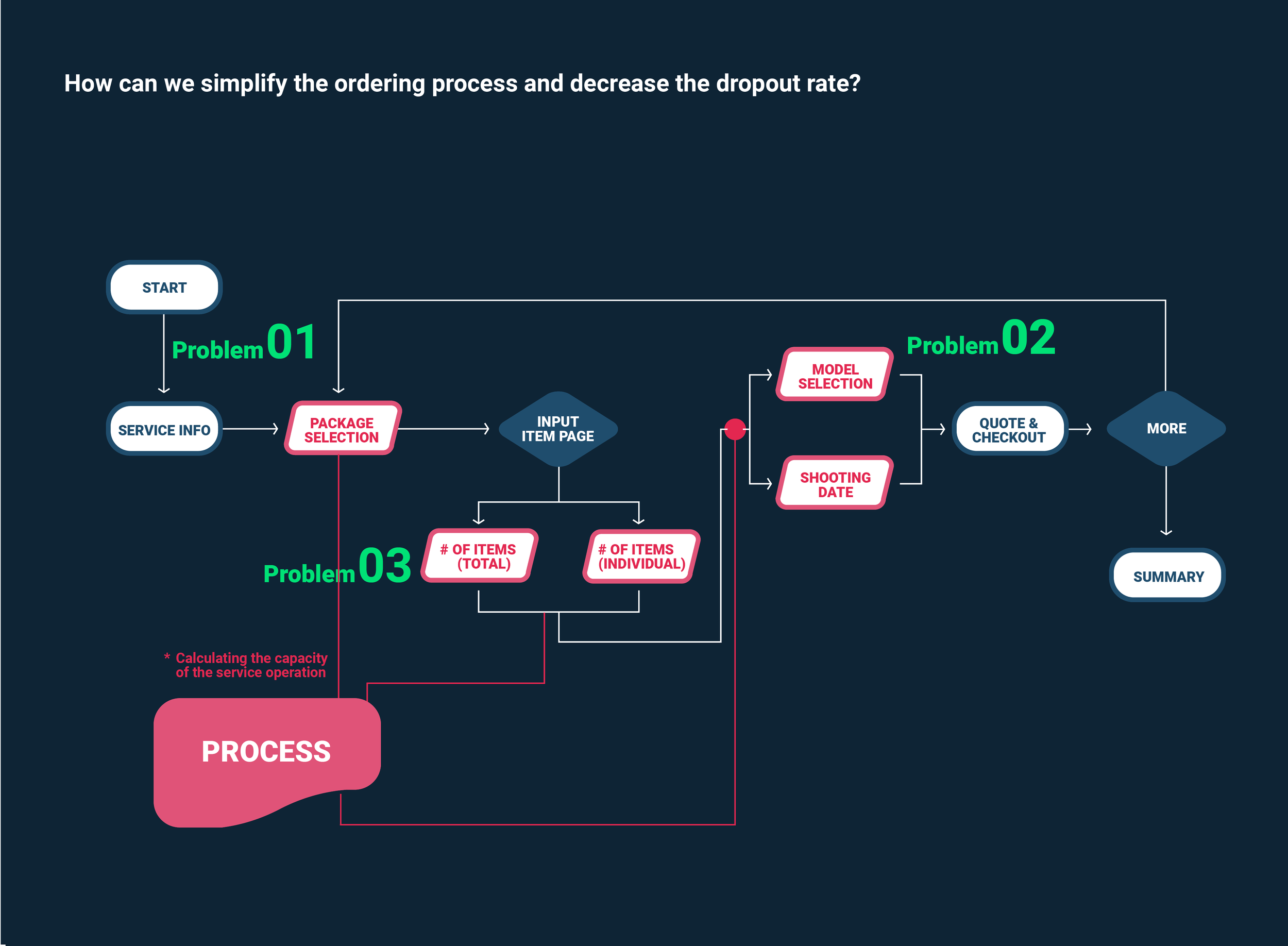
Problem 01
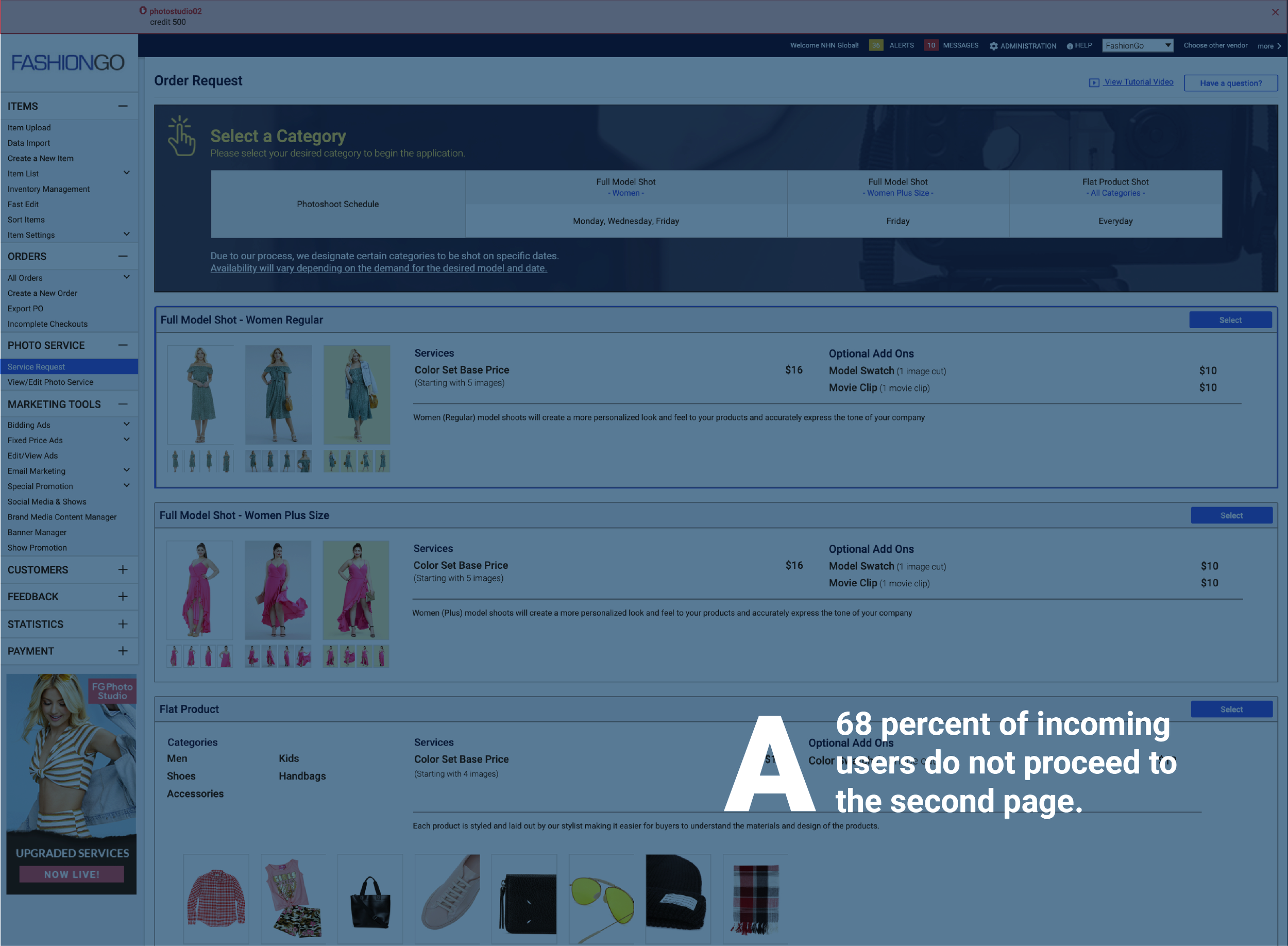
On the first page, there must be an entry barrier that
prevents users from moving to the next page.
Assumption
Users may fear getting charged just by entering the service, so they hesitate to proceed.
About 60% of users exit after the first landing page.
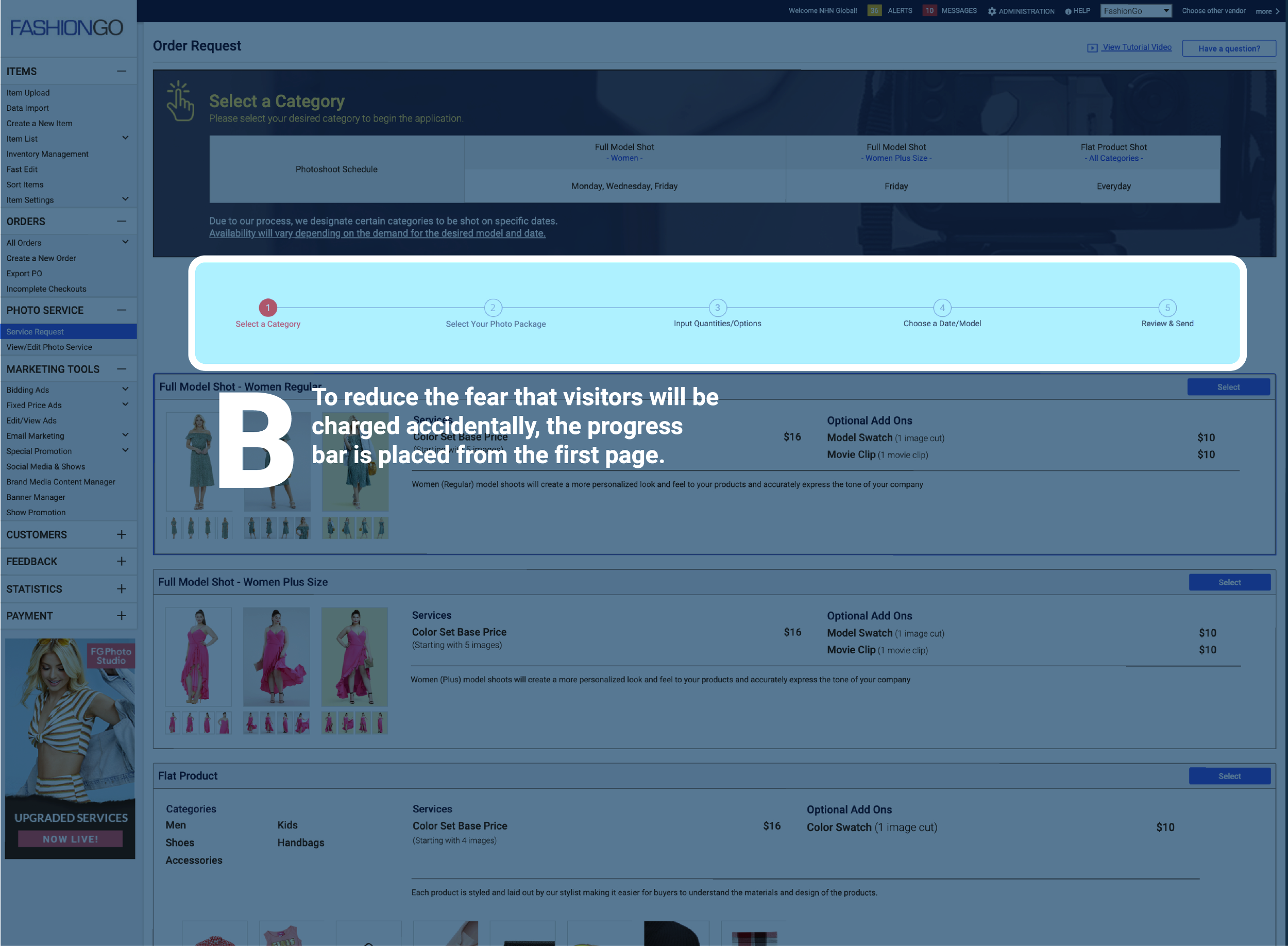
Hypothesis & Action
If we add a progress bar starting from the first page, users will better understand the steps and feel safer to continue.
Implemented a progress bar on every page (starting from page 1) with short step descriptions and remaining-step indicators.
Result
Conversion increased by about 22% from page 1 to page 2 after adding the progress bar and step guidance.
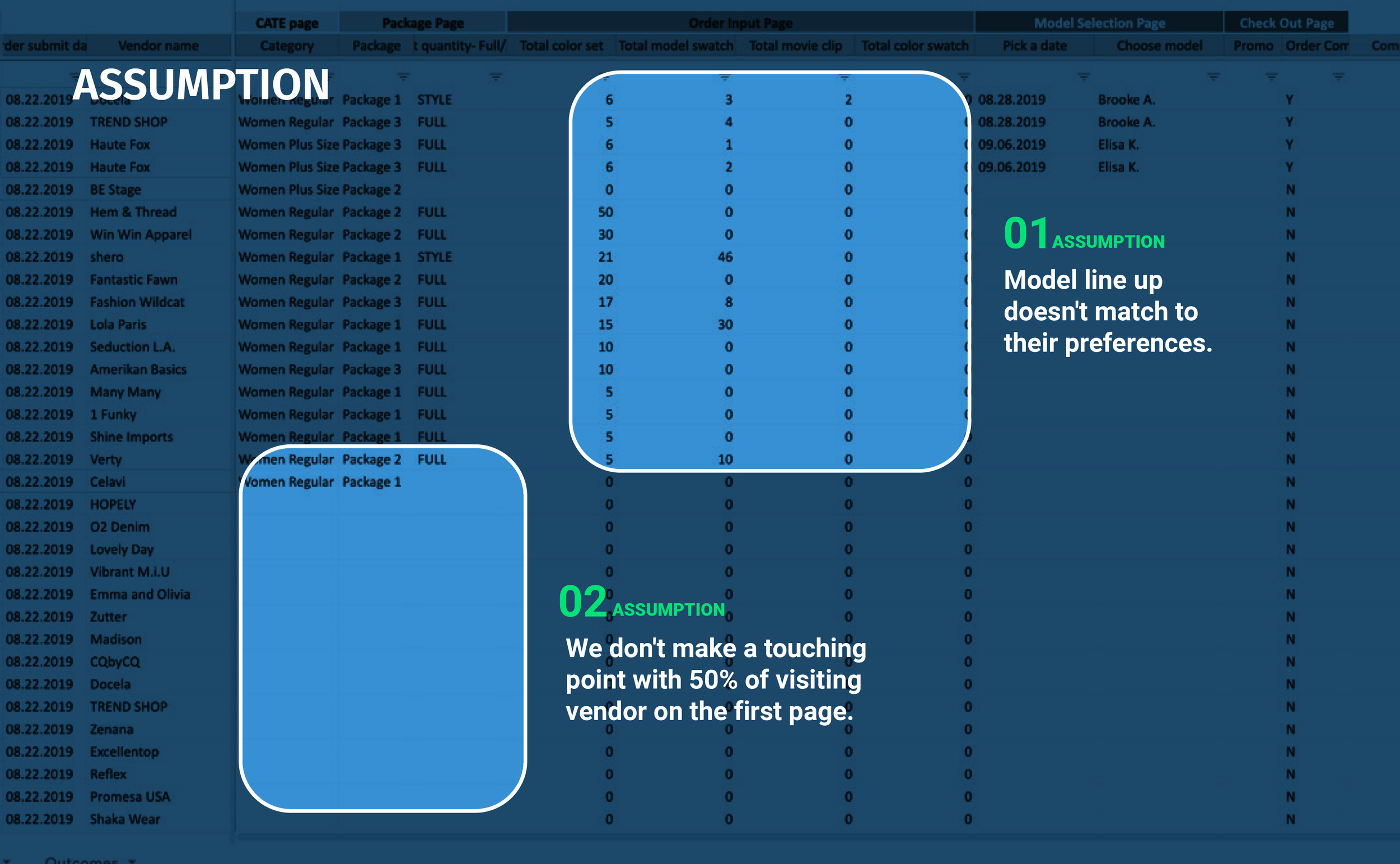
Problem 02
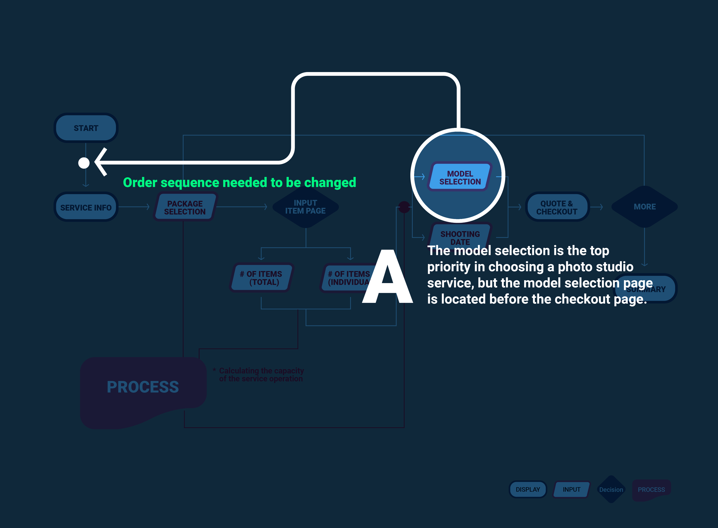
The Number of Incoming New Users
To FG Photo Studio Service Are Not Enough.
Assumption
The ordering sequence did not surface the most compelling value early, so new visitors were less motivated to explore the flow.
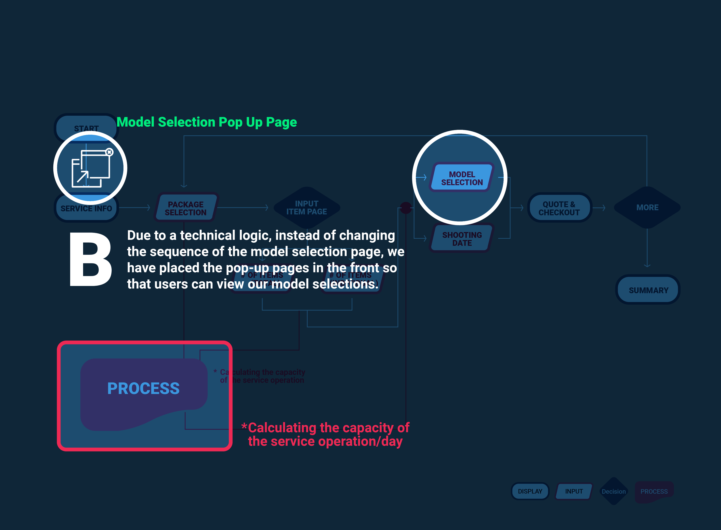
Hypothesis & Action
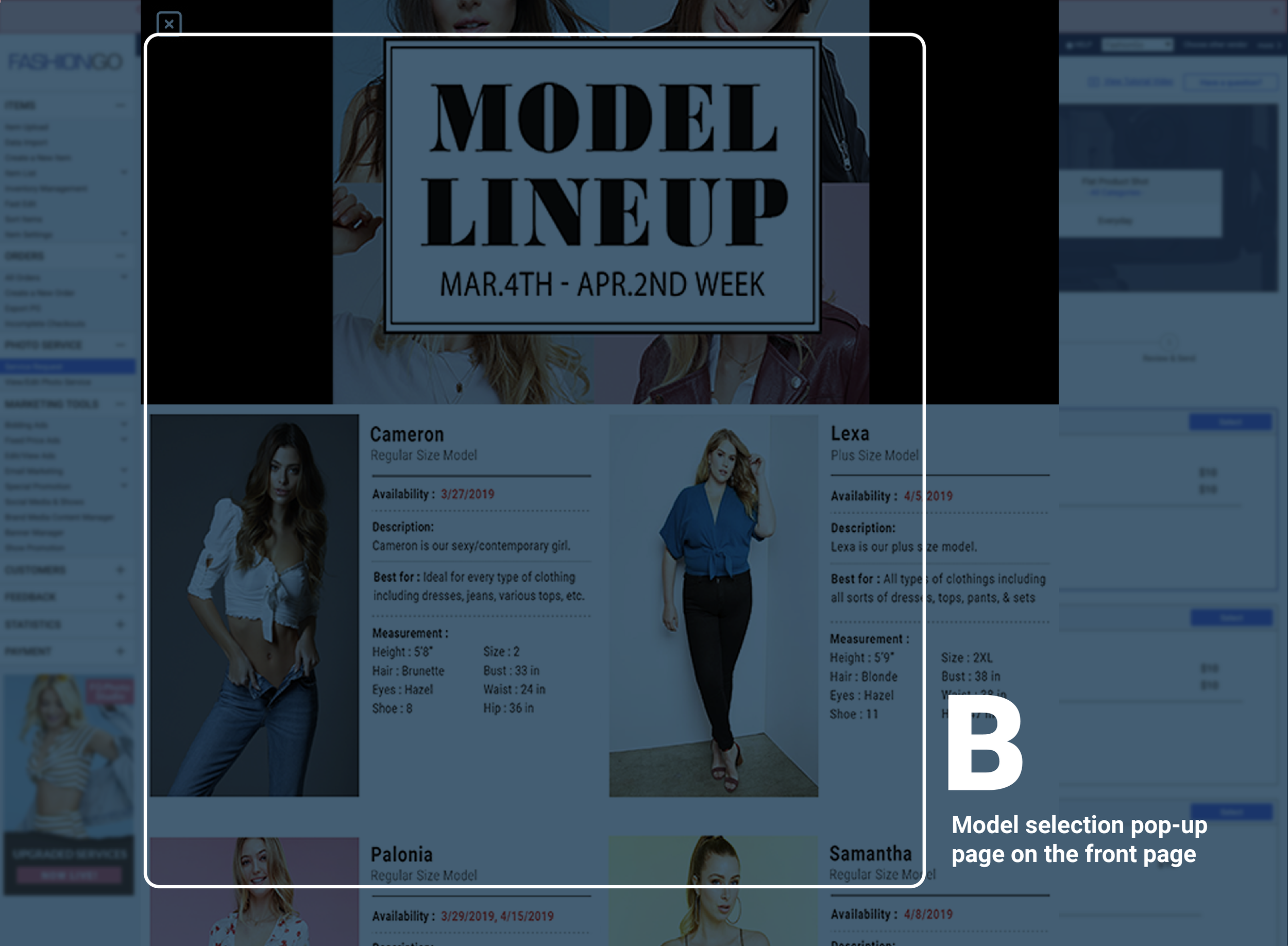
If we help users reach the model selection step faster—without changing the full ordering logic—more first-time users will continue deeper into the flow and reach the quote page.
Promoted the service through model-focused messaging and simplified options that helped users reach the model step faster.
Result
New session views increased by 15%, supported by faster access to the model step.
Problem 03
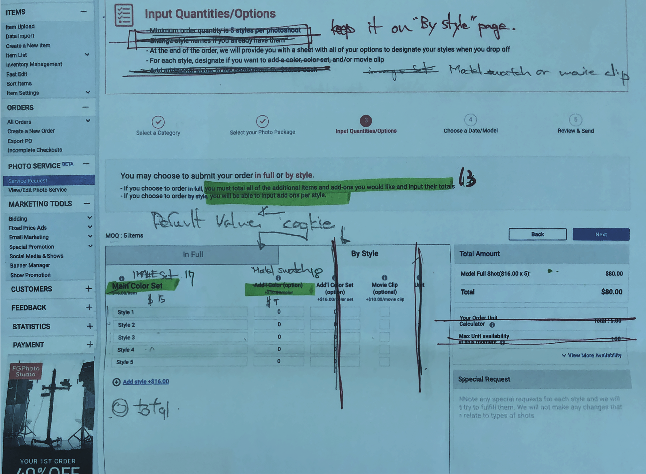
Customers misunderstood deliverables,
causing complaints and lowering order success.
Assumption
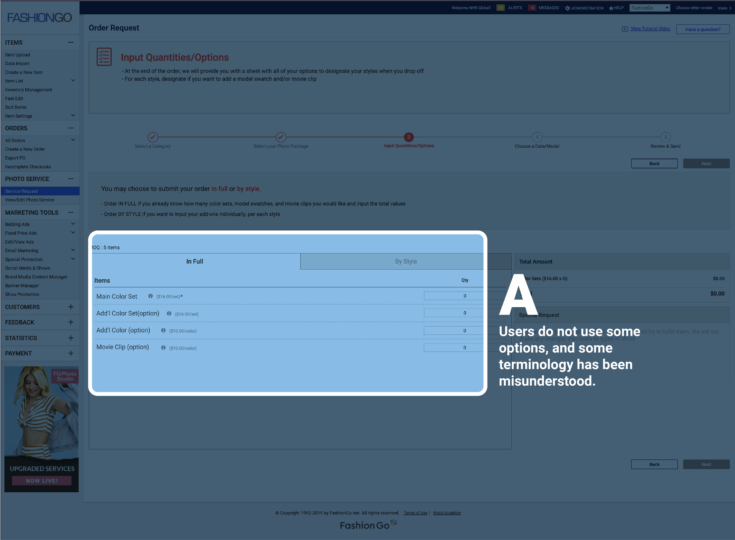
Terminology around deliverables (image sets, angles, add-ons, package styles) is unclear and can be misleading.
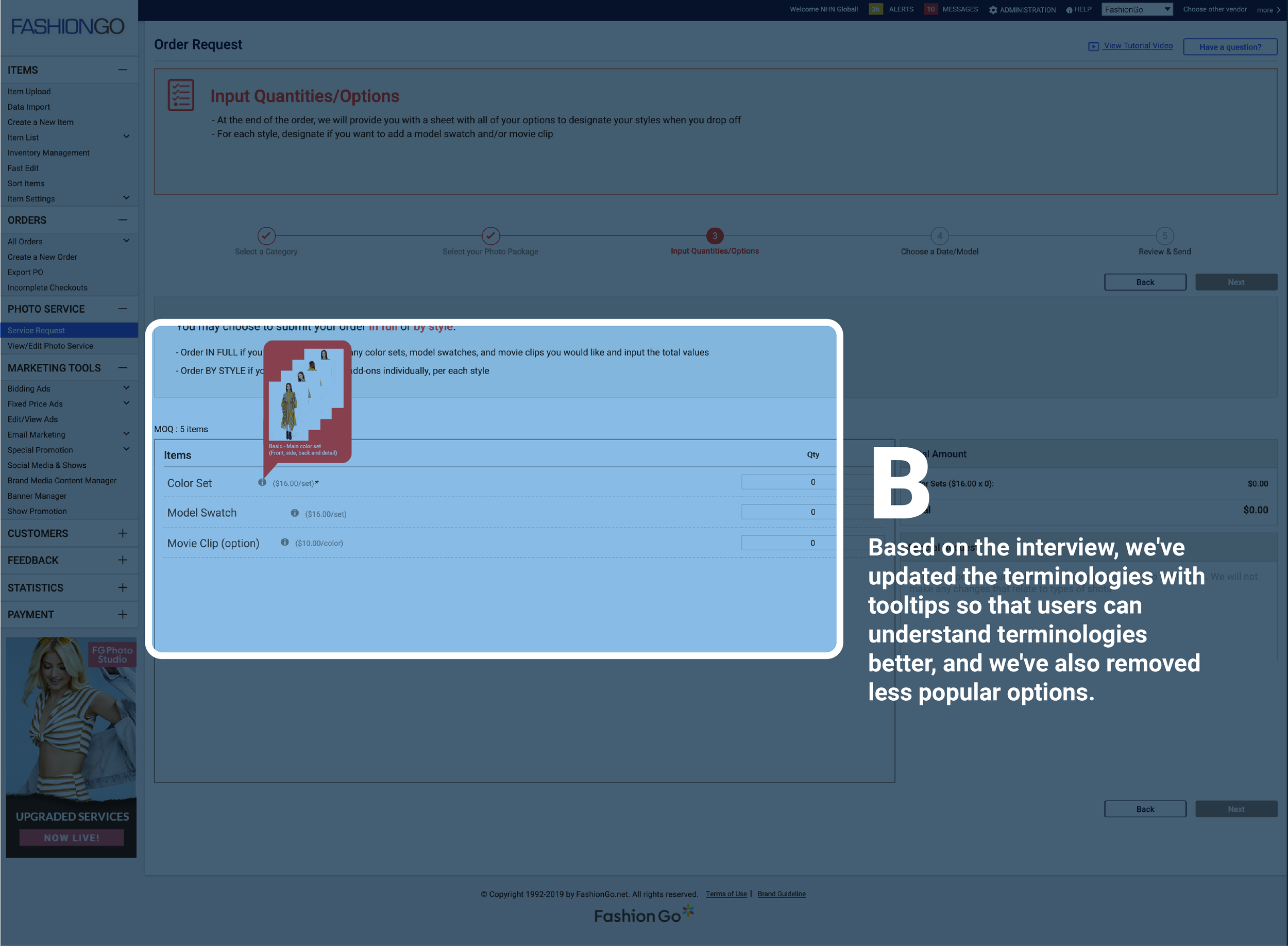
Hypothesis & Action
If we simplify terminologies and add visual tooltips, sellers will better understand deliverables, reducing complaints and improving order completion.
Removed low-use options, rewrote key terms, and added tooltip explanations with image aids to clarify what each selection includes.
Result
Order success rate increased by about 18% within a month.
Complaints decreased, improving operational capacity and reducing support burden.